New Enhancements & Features!
As a current subscriber to Rodan’s Sygration Market Dashboard, we are excited to inform you of new platform updates for ICI Participants (IESO Class A Consumers).
We have refined the dashboard and added vital tools to make it simpler to extract the information requested by ICI Participants to evaluate current, past, and future demand conditions. We anticipate that these new changes will make it easier to be successful in capturing Ontario Demand Peaks.

[gap height=”10″]
Click on the tabs below to read a full description of each new feature:
[accordion open=”1″]
[accordion-item title=”1 – Daily Peak Risk“]This handy display shows at a quick glimpse, what the peak demand is for the day, at which hour it occurs, and categorizes the peak risk. A red circle indicates a high chance of a peak for the day, while green symbolizes a low risk of a peak for the day.[gap height=”10”]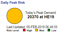
[/accordion-item]
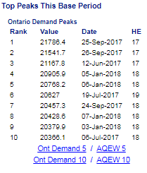
[accordion-item title=”2 – Top Peaks This Base Period“]This table displays the top 5, or top 10 demand peaks to date for the current base period, as well as the top 5 or 10 AQEW peaks (once published), allowing ICI participants to quickly evaluate the peaks to date and how far off from a current peak the near-term forecast is.[gap height=”10″]
[/accordion-item]
[accordion-item title=”3 – Ontario Demand vs GA Peak“]This widget displays the forecasted Ontario demand (blue) as well as plots the actual demand as it happens (green). A red line is also displayed, representing the current fifth peak in the base period, helping users see how far off from the fifth peak the current forecast is. Clicking on the widget shows a 7-day outlook window:[gap height=”10″]
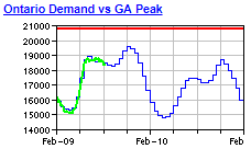
Clicking on the widget shows a 7-day outlook window, as below:

[/accordion-item]
[accordion-item title=”4 – Simplified/Customized Hourly Forecasts for ICI Participants“]The hourly forecast has been simplified and prioritized to only show items which ICI participants are likely most interested in, removing all other information. These items can be further simplified (remove more items) or expanded upon (adding more items) depending on user preference. For the simplified experience, only the following items are displayed in the hourly 24-hour window:
- Predispatch/dispatch – Ontario demand (forecasted = blue, actual = black)
- Predispatch/dispatch – Ontario load – an estimation of AQEW, calculated by Sygration
- Predispatch/dispatch – energy price (forecasted = blue, actual = black)
- Ontario Composite Temperature – a weighted average temperature of main load centers in Ontario, exemplifying what the temperature is across Ontario as a whole, and allowing users to weigh how hot or cold the temperatures are across the province (strong driver of Ontario demand)
- Toronto Downtown Temperature – as the largest load center in the province, temperatures in the city have a strong impact on Ontario demand
- Variable Generation (wind and solar) – displays the estimated magnitude of embedded, behind the meter renewables across Ontario (more embedded generation = lower Ontario demand, lower embedded generation = higher Ontario demand)
- Dispatchable Load Scheduled – displays the scheduled bids of Dispatchable Loads in the province (shows the load patterns of some of Ontario’s largest, most sophisticated Class A consumers)

A number of alerts and alarms have also been pre-programmed, displaying messages or highlighting variables when Ontario demand forecasts and other factors affecting demand are above a certain threshold (high chance of a peak), when demand forecasts suddenly change by a large amount, when forecast error is high, and other items to better draw your attention to important trends in the data.[gap height=”10″]
[/accordion-item]
[accordion-item title=”5 – Dispatchable Load Graph“]As described earlier, this Dispatchable Loads widget shows the load patterns of some of Ontario’s largest, most sophisticated Class A consumers in a graphical format. Typically a dip in the MW can be observed during peak days.[gap height=”10”]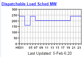
[/accordion-item]
[accordion-item title=”6 – Filtered Console Messages“]Console message filtering allows the user to choose which types of messages populate in the dashboard. This simplified ICI template only displays ICI notifications, and ICI alerts/alarms (removing notifications more related to generation and distribution), keeping the message area clean.[gap height=”10”]
[/accordion-item]
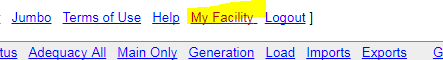
[accordion-item title=”7 – My Facility Dashboard“]A link to Rodan’s Energy Management Information System (subscription required) – a powerful platform which includes various modules allowing users to observe their facility’s load in real-time alongside Ontario demand, generate GA performance reports with calculated peak demand factor, and cost estimates, monitoring and targeting for energy efficiency, participation in Demand Response programs and much more.[gap height=”10”]
[/accordion-item]
[/accordion]
If you have any further questions or concerns, have feedback, or would like us to apply the described dashboard template to your accounts, please do not hesitate to reach out to us.